Sketch ● Figma ● InVision ● Abstract
UX Design in Action: Revamping the EstateSales.NET Refund Workflow
Overview
EstateSales.NET is a responsive web app that allows people to advertise and sell items from estate sales and auctions. It receives over 100 million page views monthly and has an eCommerce marketplace for professional estate liquidation companies. Recently, my team developed a feature for the eCommerce marketplace that combines individual purchases from the same buyer into one order and transaction in order to reduce processing fees and improve order management. However, we discovered that the existing refund workflow would not support the new feature and needed to be redesigned.
Given a five-week time constraint, our team of three designers and two developers set out to revise the refund workflow in an agile environment, focusing on minimal backend and database changes and improving the frontend experience on the responsive web app.
As Lead UX/Product Designer, I oversaw the entire project from discovery to handoff and implementation to production. I played a vital role in the design strategy and conducted user testing to gather valuable insights. I facilitated cross-department workshops to ensure effective collaboration and communication and presented my findings to executives. Additionally, I was responsible for designing the refund workflow process, creating wireframes, lo-fi and hi-fi prototypes, and other relevant deliverables.
The Problem:
The refund system lacks clarity and transparency during the application and reporting to support orders with multiple items.
Our user testing revealed that the current refund system was confusing and inefficient for the end user when used with the new combined auction transaction feature. Owners and employees of estate sale and auction companies, who make up a significant portion of our user base, struggled to issue and understand refunds during testing. This lack of confidence in the refund process could lead to unhappy customers and potentially harm the reputation/trust of EstateSales.NET’s brand and order management process.
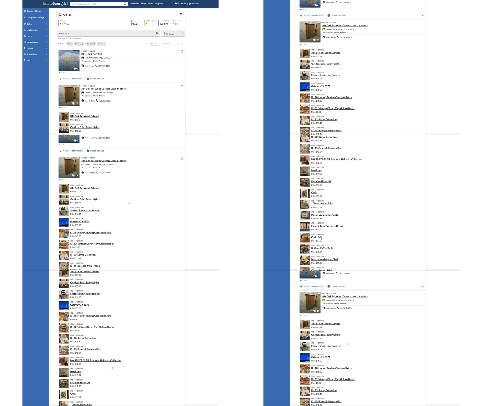
User Testing Task Results: Adding Multiple Items to an Order within Order Management
Research Methods Used
User Feedback
Internal Testing
User Testing
Secondary Research
The research aimed to understand users' experiences and expectations during the refund process and identify their needs to design a more intuitive and user-friendly experience. We analyzed their behaviors when refunding single and multiple items using the current system to understand their goals and priorities.
Users/Audience
Our user base includes owners and employees of the estate sale and auction companies, buyers, and clients of liquidation companies. These individuals may be novice or expert users using our platform on mobile devices or desktop computers.
Empathy Map
My team and I conducted an empathy map exercise to understand our users' motivations and feelings better when using the current refund system. This helped us identify common pain points and areas for improvement.
Behavior Patterns:
Based on our user testing, we noticed that company employees and owners were unsure and hesitant when issuing refunds. They were concerned about over-refunding or misreporting the reimbursement. Additionally, users struggled to understand their refund status and could not easily view which items in an order had been refunded.
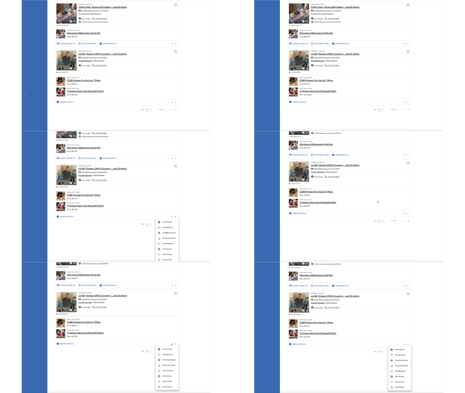
User Testing: Applying Multiple Items within an Order with the Existing Refund System
3 Key User Testing Insights
The system misaligned with the user’s mental model once the orders allowed multiple items within the order.
The system also relied on the user to recall the cost of each item.
It lacked feedback and specific critical information within the reports once the order had multiple items within it.
Business Importance
The ability to issue and understand refunds is crucial for the success of the companies using our eCommerce platform. If the refund process is confusing or unreliable, it could lead to frustrated customers, harm the trust we just reestablished/improved several months prior within the order management system, and decrease in retention of companies using our e-commerce platform. Therefore, it was important for us to address these issues before releasing the combined auction transaction feature.
If users are unable to process, understand, or obtain a refund when they or their customer is unhappy with an order, they will be less likely to use our platform again in the future. EstateSales.NET’s reputation may suffer due to this issue, and lead to decreased revenue over time as well as a loss of trust from potential clients or partners who may be hesitant about working with us if they do not see us as a legitimate business.
Hypothesis
Allowing refunds to be applied to specific items within an order would provide clarity and transparency to both the process and reporting of refunds so company owners and employees can develop the confidence to use the system without interference.
Defining Success
An increase in the confidence of company employees and owners in issuing refunds
An increase in buyer satisfaction with the refund process
A decrease in the time it takes to issue a refund, leading to improved efficiency and productivity
A decrease in the number of refund-related customer support inquiries, indicating a reduction in user frustration or friction.
HMWs Used to Reframe Problems
Understand the Differences in the Current Production Experience
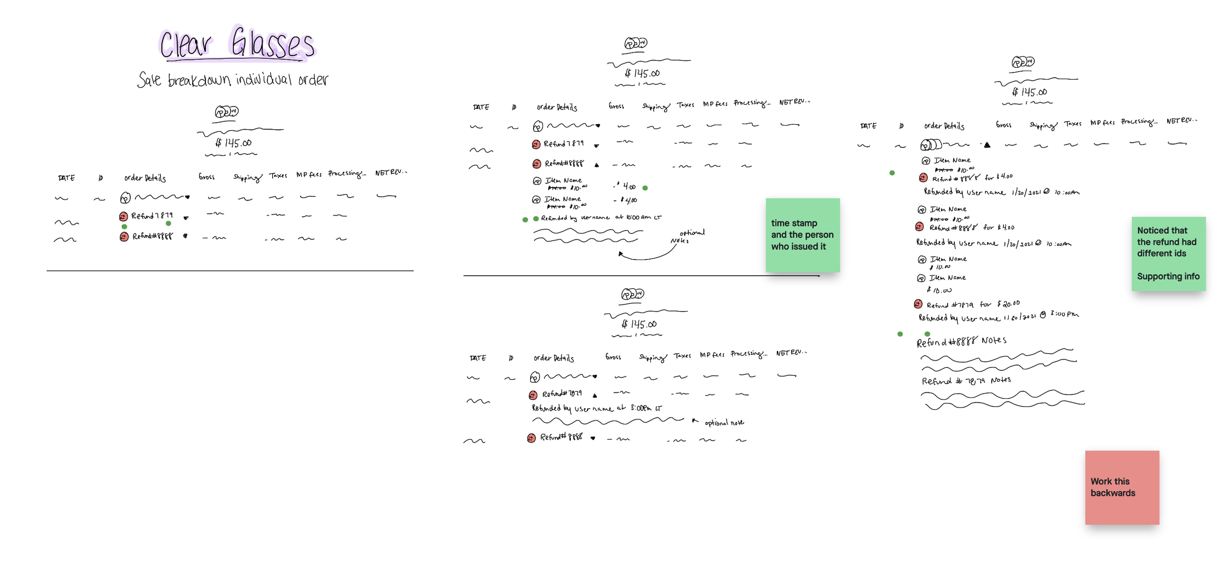
I wanted to understand the differences in the current production experience for single-item orders versus the tested multiple-item orders. To visualize the production workflow, I created a simple chart using InVision freehand. This allowed me to quickly see the entire process and identify where improvements could be made.
Interested in interacting with the pre-existing workflow with one item within an order? Check out the prototype.
Production Experience Differences
One item per order allowed for individual item refunds which aligned with users' mental models and made the refund process more intuitive on production versus the tested multiple-item orders.
By only having one item per order, the cost of a single item within an order was always displayed, making the system less complex and easier for users to understand.
The feedback provided to users was more specific and tailored to the individual item, rather than the entire order when there was only one item per order.
Lightning Demos & Ideation Excercise
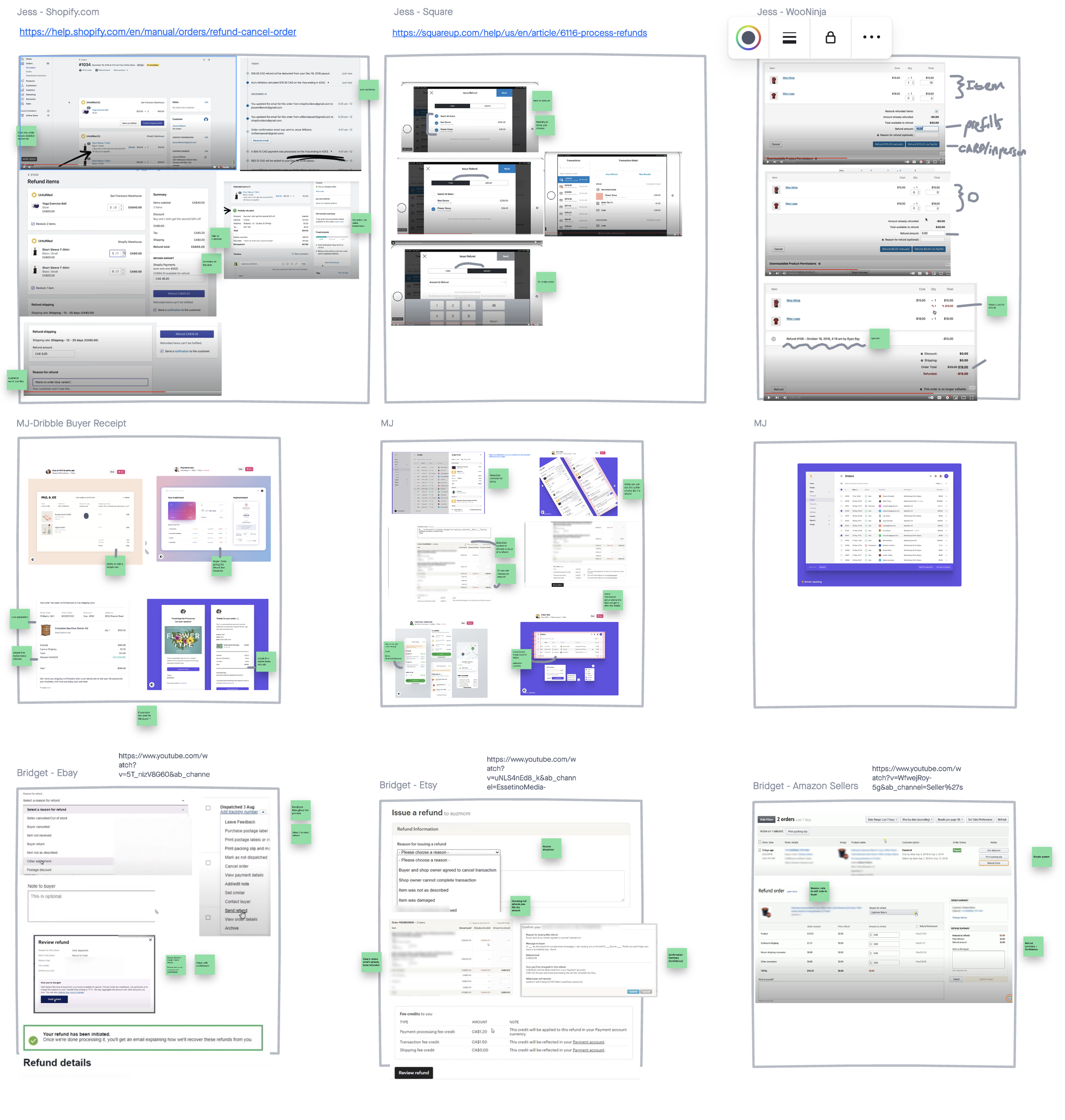
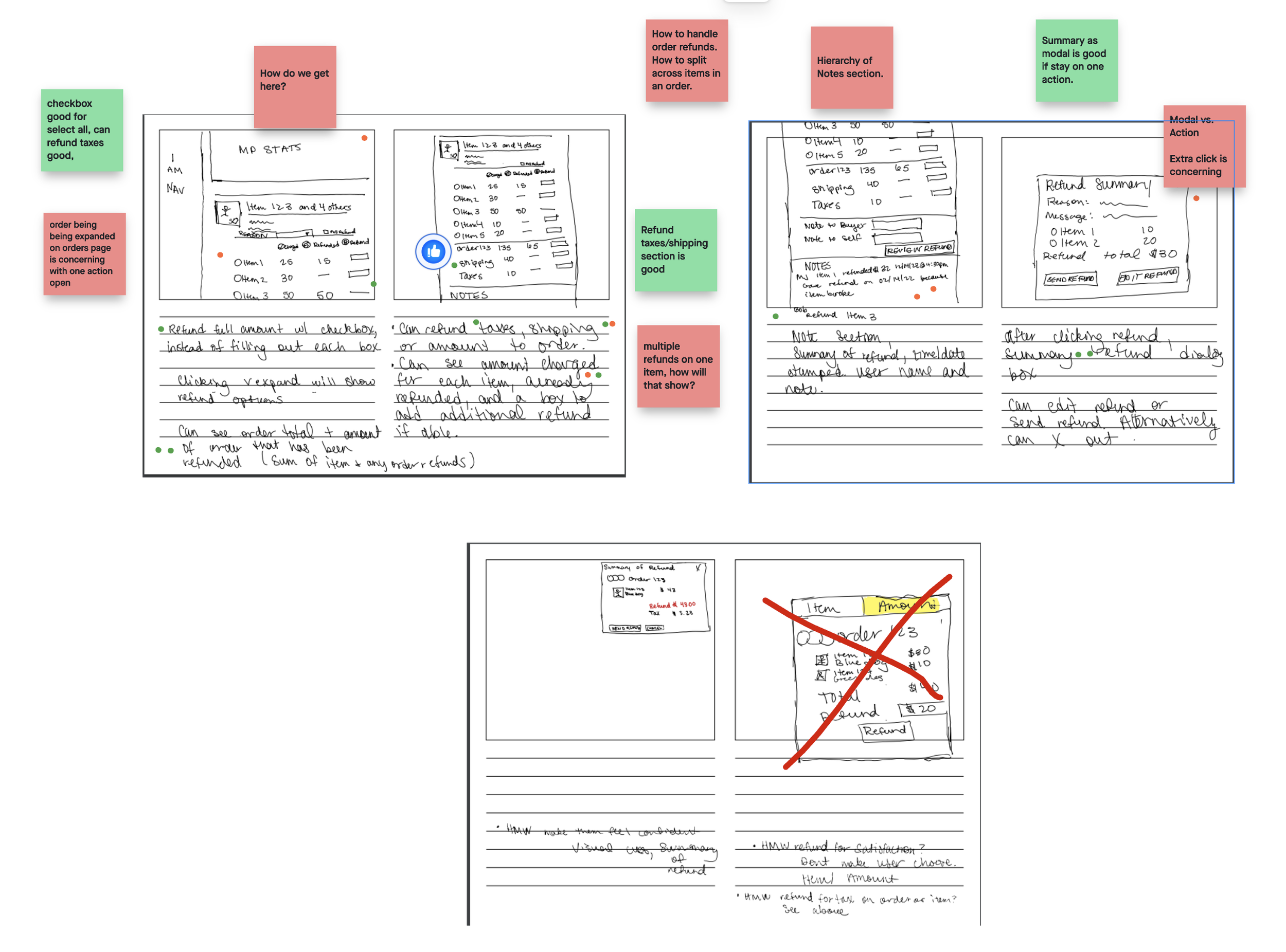
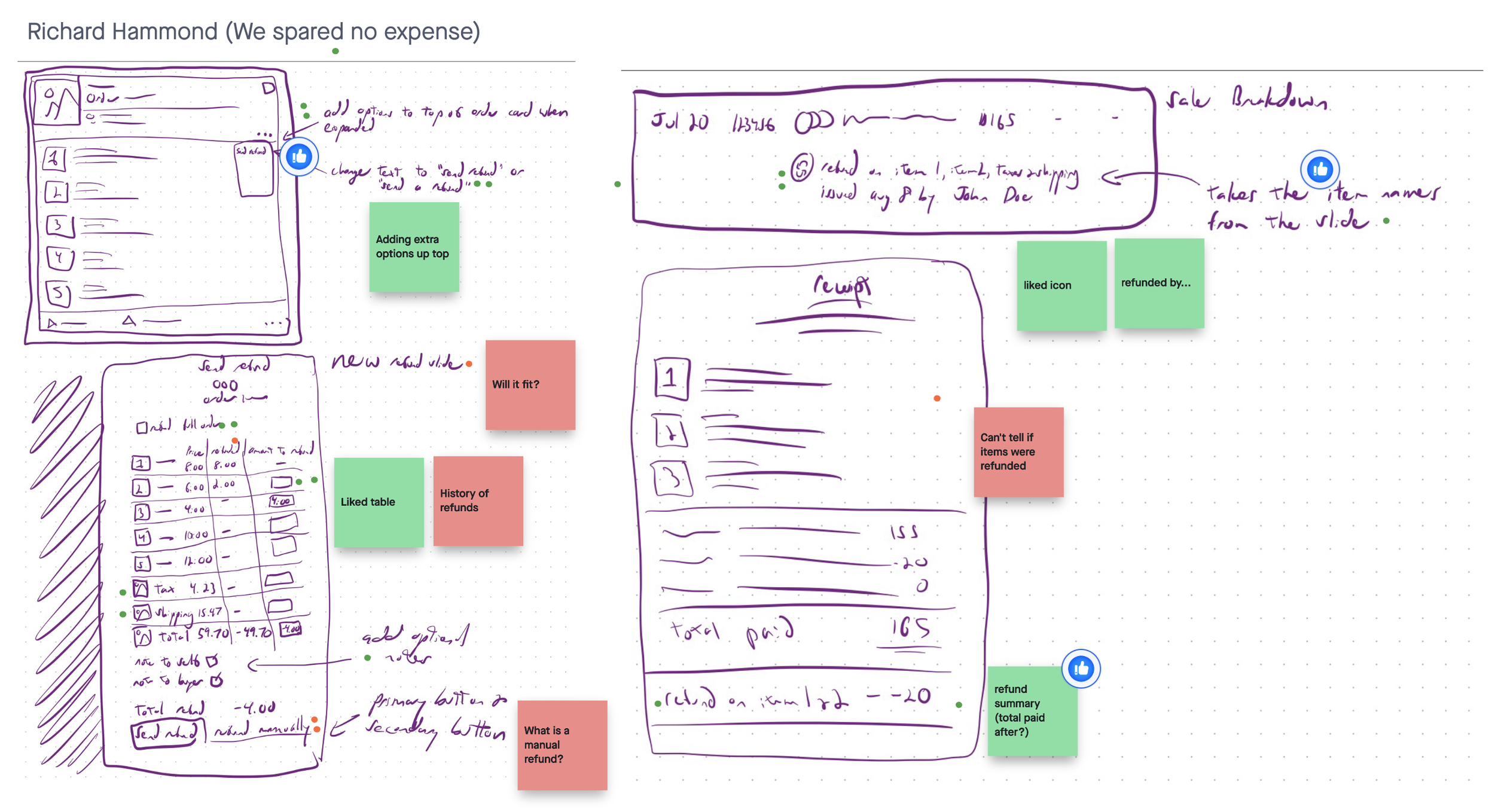
In a time crunch, I rallied my team for a mini sprint where we delved deeper into understanding. We sought help from experts, our support team, and gathered feedback to gain more empathy for our users and their business models. Our lead developer provided technical insights into the current system, and we conducted a high-level competitor analysis. We also created a storyboard to visualize the user's journey and broke it down into manageable pieces for our team to work on. Through low-fi ideation and critique, we identified three main areas to focus on: the action of refunding, reporting to the seller, and reporting to the buyer. I delegated each designer to a specific area to ensure we could complete the task within the given timeframe. I personally took on the task of improving the refunding process from the order management system, as I had the most experience in that area.
Just Enough Iteration and Research
I knew my designs would need to be tested, to help create better iterations of the process, but unfortunately, the resources for this project couldn’t suffice for recurring, and scheduling those tests with our users. So I compromised and tested iterations with our support team members in several rounds of testing. To do so, I created prototypes within Sketch and Invision with the task of refunding single and multiple-item orders.
Solutions
Aligning with User’s Mental Models: Item-Based Refunds
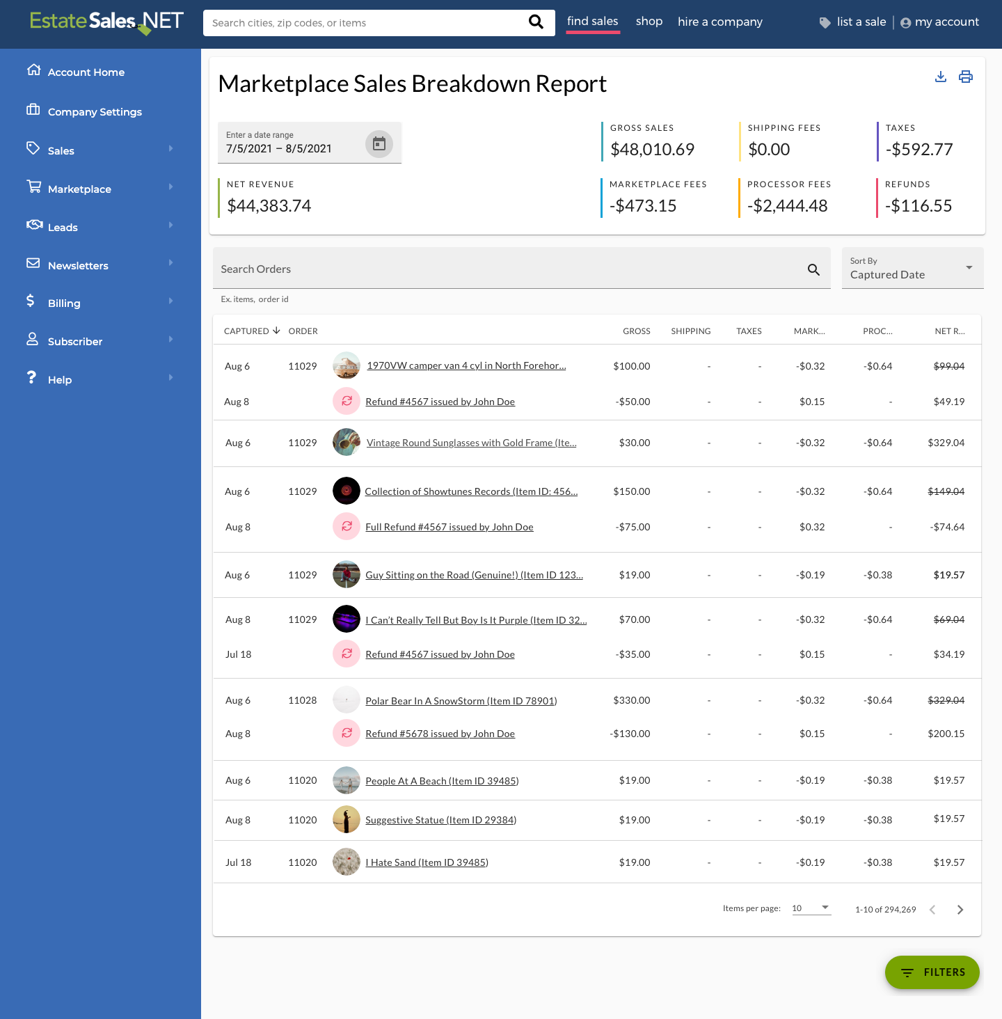
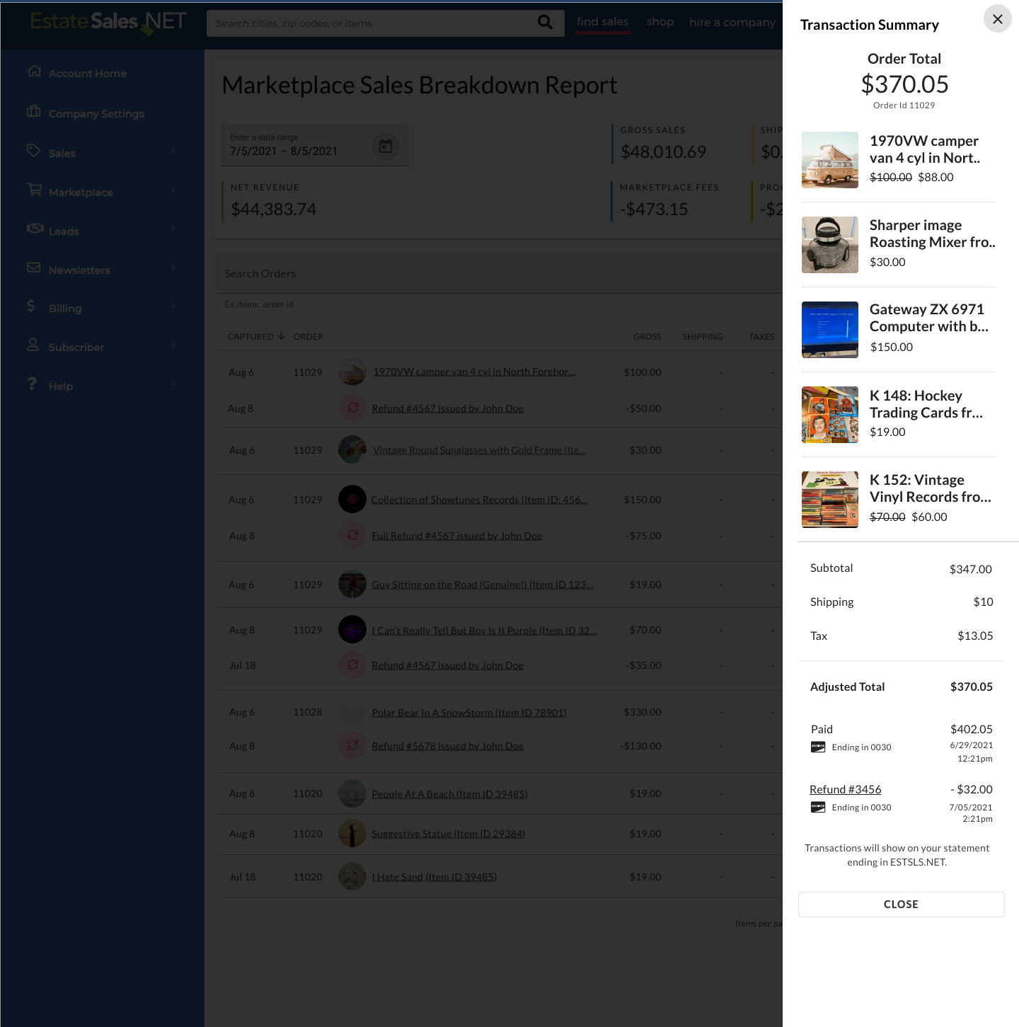
During the redesign process, we implemented several solutions to address the issues identified in our research. To align with users' mental models, we made the refund process item-based. We also reevaluated the types of refunds available and gave sellers more autonomy in the refund application process. We provided specific information about the refunded item on the order management page, sales breakdown report, and receipt to improve transparency and clarity.
Maintaining Consistency & Improving Predictability
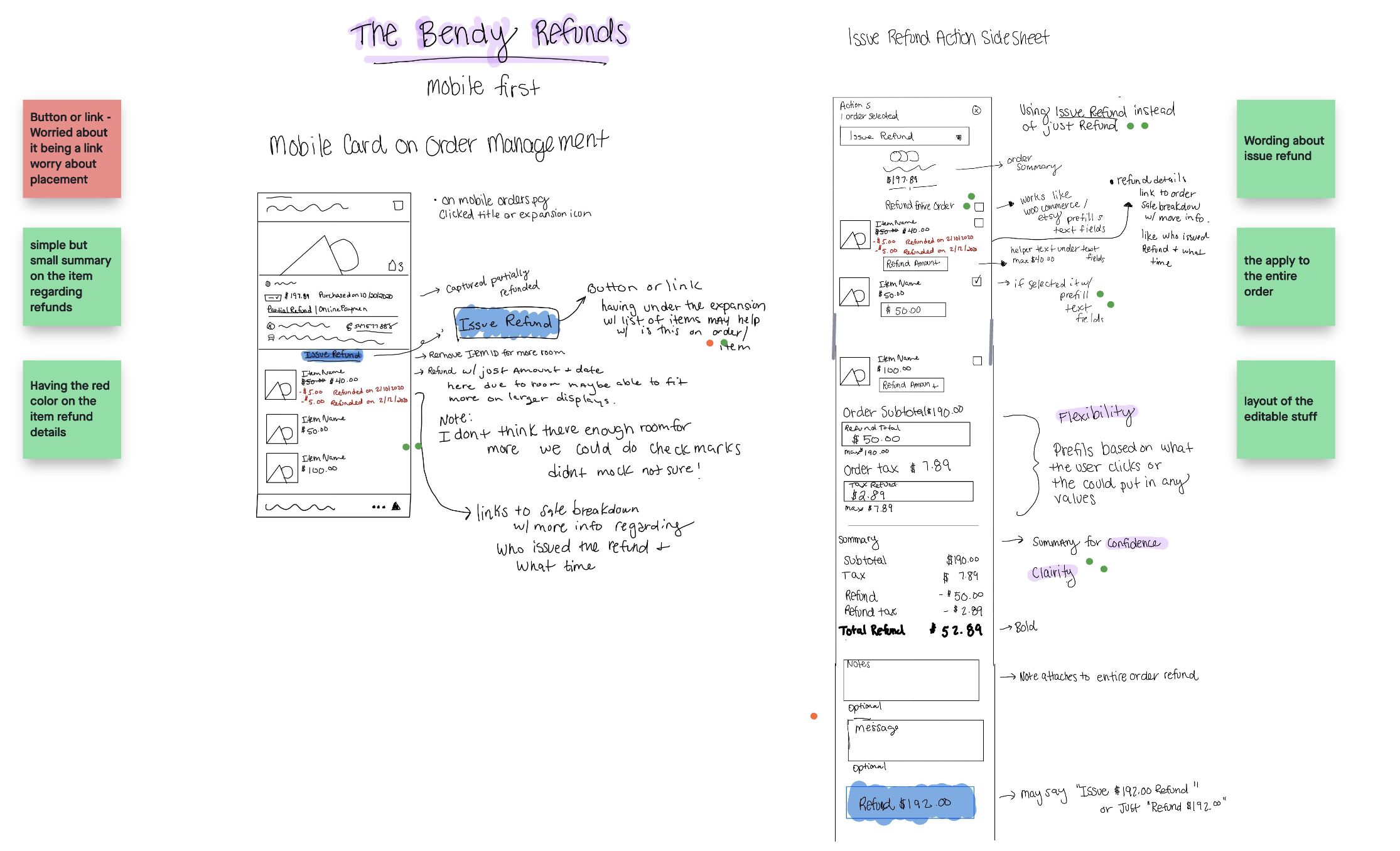
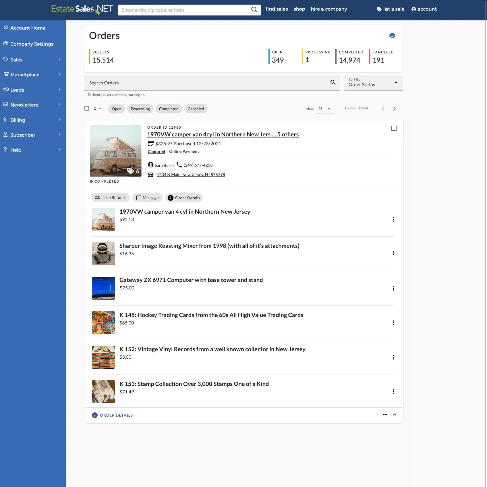
To provide a seamless user experience, I strategically placed the refund option within the pre-existing order management workflow. Specifically, I kept the refund option as a link within the "more options" ellipsis menu, as it was a secondary action within the overall workflow of managing orders and it was where users were already accustomed to finding it. To increase visibility, I made the refund option more prominent in this location. Based on user testing observations, I recognized that when users were managing multiple items within an order, the ability to quickly and easily refund specific items was crucial to their journey. Therefore, by connecting the refund option to the individual items, it provided more context and improved discoverability during this specific user task. This design decision was informed by the feedback from our user testing sessions and aimed to improve the overall user experience.
Refunding an Item: Managing Visual Complexity & Improving Findability
To improve findability, learnability, efficiency, and error rate, I used poly hierarchy and progressive disclosure as an enhancement. I removed unnecessary information, such as the item ID, and used grouping and visual hierarchy to manage the complexity of the design.
Adding Meaningful Defaults & Using Predictability
I also added meaningful defaults for selecting the refund amount and made strategic placement decisions to aid with visual search. Overall, my solutions focused on putting things in predictable places, using graphical signals and hierarchy to aid visual search, and using progressive disclosure to hide irrelevant information or secondary information.
Designing Reusable List of Items Patterns to Provide Scalability
I designed a reusable pattern for a list of items to improve the user experience and provide scalability for future features and updates. I gathered data from user testing, interviews, and feedback to create the pattern. I then tested it and made adjustments as needed. The pattern was applied to four different instances on the platform, including the order management page, the item-based refund process, the refund summary, and the transaction summary. This pattern not only improves the user experience but also allows for future growth and updates to the platform, saving time and effort in designing new features and creating consistency for users.
Results
Through our redesign of the refund workflow, we were able to significantly improve the clarity and transparency of the process for issuing and understanding refunds. Our user testing showed that the revised process was easier to use and understand, leading to increased confidence and satisfaction among users. We measured the success of our solution through user feedback and performance metrics, such as the time taken to complete the refund process and the number of successful refunds. This laid the foundation for the successful rollout of the combined auction transaction feature.


